Analysing student data using R and the tidyverse
An alternative to Excel?
Most teachers use a spreadsheet program such as Microsoft Excel or OpenOffice Calc to analyse data relating to their students’ attainment in order to inform their teaching. For me, R doesn’t replace Excel because I still use spreadsheets to input and store this data, but it does allow me to gain a deeper understanding of the data.
What is R and why use it?
R is an open-source statistical programming language that allows you to perform tasks that would be difficult or impossible using spreadsheets. You write code in plain text (for example using the free RStudio IDE) and it is interpreted by R, which outputs the results in your chosen format; this could be a graph (e.g. a PNG image or PDF file) or a table of data (e.g. an Excel spreadsheet or CSV file).
The programmable nature of R means that you can re-use the same code to analyse different datasets – such as subsequent sets of exam results – and it’s great for repetitive tasks such as creating an individual graph of results for each separate pupil from a year group. As is the case with Markdown documents, if you wish, R’s plain-text code can be version controlled using Git; this also allows it to be worked on collaboratively e.g. using GitHub or BitBucket. Using the Markdown-based R Notebook format is also a great way to share your code alongside text and graphs.
Whereas spreadsheet programs hide formulae away, using R means that your code (and therefore your analytical process) is clearly visible. Here’s a simple example of importing some data and calculating the average mark achieved for a particular test:
# load a package for reading Excel spreadsheets
library(readxl)

# import the markbook spreadsheet
markbook <- read_excel('markbook.xlsx')

# calculate average of TopicTest column, output below
mean(markbook$TopicTest)
#> [1] 60.8
What is the tidyverse and why use it?
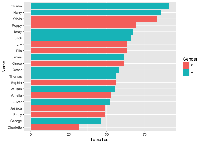
The tidyverse is a set of packages which build on the base R language, creating a set of tools that together provide a streamlined workflow for importing, wrangling and visualising data. The tidyverse packages make code easier to read and write, for example by providing the ‘pipe’ operator (%>%) and a set of logically named functions such as filter, select and summarise. The ggplot package provides a logical and flexible way to plot graphs, for example the bar chart below:
# load the tidyverse packages
library(tidyverse)

# pipe markbook data through multiple functions
markbook %>%
  # reorder Names by TopicTest score
  mutate(Name = fct_reorder(Name, TopicTest)) %>%
  # specify x and y axis variables and fill colour variable
  ggplot(aes(Name, TopicTest, fill=Gender)) +
  geom_col() +  # create bar chart
  coord_flip()  # flip axes to create horizontal bars
Learning to use R and the tidyverse
If you haven’t already, why not read my walkthrough of analysing exam data using R and the tidyverse? If you’d like to learn more about R and the tidyverse, Hadley Wickham and Garrett Grolemund’s book R for Data Science (available electronically for free) is a great place to start. If you have any questions about using R to analyse student data, why not get in touch with me on Twitter?