Analysing exam data with R and the tidyverse: a walkthrough
I often use R and the tidyverse to analyse student data. In this post I’ll walk through the process of analysing 20 fictional students’ performance in an exam paper, a process that I’ve used in the past to analyse real data. If you’d like to follow along, you can download the markbook.csv and questions.csv data files.
Loading packages and data
First let’s load the packages and data files we’ll need. In this case we’re loading CSV data files, but these could easily be Excel spreadsheets loaded with the readxl package’s read_excel function.
library(tidyverse)  # load core tidyverse packages
library(magrittr)  # for %<>% (compound assignment) operator
library(scales)  # for pretty_breaks() and percent_format()
library(knitr)  # for kable (outputs nicely formatted tables)

markbook <- read_csv('markbook.csv')
questions <- read_csv('questions.csv')
Markbook data
The markbook tibble we’ve created is a sample markbook containing students’ marks for an end-of-topic test and our exam (with marks for each sub-part included separately) in the wide format generally used for storing this kind of data. Here’s a preview of the first few rows and columns:
markbook %>%
  arrange(Name) %>%
  head() %>%
  select(1:7) %>%
  kable(format='markdown')
| Name | Gender | TopicTest | ExamQ1a | ExamQ1b | ExamQ1c | ExamQ1d |
|---|---|---|---|---|---|---|
| Amelia | F | 53 | 1 | 1 | 1 | 2 |
| Charlie | M | 91 | 1 | 1 | 1 | 3 |
| Charlotte | F | 32 | 0 | 1 | 1 | 2 |
| Ella | F | 63 | 1 | 1 | 1 | 3 |
| Emily | F | 49 | 1 | 1 | 1 | 3 |
| George | M | 46 | 1 | 1 | 1 | 3 |
You might think it’s extra work to input each student’s mark for each sub-question rather than just the total mark for each student, but I don’t find it any more time consuming; I’d probably add up the marks using a calculator anyway so might as well input them into a spreadsheet!
Exam paper data
The questions tibble we’ve created above contains a list of all the sub-questions in our fictional exam paper and how many marks could be achieved in each sub-question (the Possible column). We’ll use mutate to add a QuestionID column – this will contain an ID for each question which matches the column headers from the markbook (e.g. ExamQ1a) – then we’ll preview the first few rows.
questions %<>%
  mutate(QuestionID = paste0('ExamQ', Number, Part))

questions %>%
  head() %>%
  kable(format='markdown')
| Number | Part | Possible | QuestionID |
|---|---|---|---|
| 1 | a | 1 | ExamQ1a |
| 1 | b | 1 | ExamQ1b |
| 1 | c | 2 | ExamQ1c |
| 1 | d | 4 | ExamQ1d |
| 2 | a | 1 | ExamQ2a |
| 2 | b | 1 | ExamQ2b |
Joining the markbook and exam paper data
For analysis and plotting using the tidyverse, it’s more useful to have the exam marks in a tidy (i.e. long) format rather than the wide format generally used for a markbook. Let’s create an exam tibble for the exam marks, using the gather function to tidy the markbook data and joining the questions tibble to add the maximum marks for each sub-question (the Possible column). Then we’ll preview the first few rows for one of our students: Oliver.
exam <- markbook %>%
  select(Name, starts_with('ExamQ')) %>%
  gather(key=QuestionID, value=Score, starts_with('ExamQ')) %>%
  left_join(questions)

exam %>%
  filter(Name == 'Oliver') %>%
  head() %>%
  kable(format='markdown')
| Name | QuestionID | Score | Number | Part | Possible |
|---|---|---|---|---|---|
| Oliver | ExamQ1a | 1 | 1 | a | 1 |
| Oliver | ExamQ1b | 1 | 1 | b | 1 |
| Oliver | ExamQ1c | 1 | 1 | c | 2 |
| Oliver | ExamQ1d | 3 | 1 | d | 4 |
| Oliver | ExamQ2a | 0 | 2 | a | 1 |
| Oliver | ExamQ2b | 1 | 2 | b | 1 |
Students’ overall performance
Let’s use group_by and summarise to calculate the total mark for each pupil as well as their percentage score. We can then create a new Grade column using mutate and assign a grade based on the percentage score achieved using case_when. Finally we’ll preview the first few rows.
exam %>%
  group_by(Name) %>%
  summarise(Total = sum(Score),
            Percentage = sum(Score) / sum(Possible)) %>%
  mutate(Grade = case_when(
    Percentage >= 0.75  ~ 'A*',
    Percentage >= 0.675 ~ 'A',
    Percentage >= 0.60  ~ 'B',
    Percentage >= 0.525 ~ 'C'
  )) %>%
  head() %>%
  kable(format='markdown')
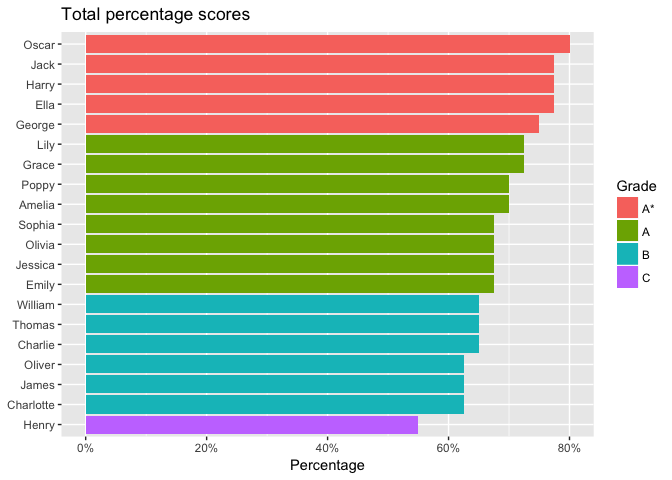
| Name | Total | Percentage | Grade |
|---|---|---|---|
| Amelia | 28 | 0.700 | A |
| Charlie | 26 | 0.650 | B |
| Charlotte | 25 | 0.625 | B |
| Ella | 31 | 0.775 | A* |
| Emily | 27 | 0.675 | A |
| George | 30 | 0.750 | A* |
To the end of the previous chain of commands, we’ll add some more in order to visualise students’ overall exam performance. Let’s use fct_relevel to sort the grades A*, A, B, C rather than A, A*, B, C. Then we’ll plot a bar chart using ggplot. We use fct_reorder to reorder the names on the x axis depending on the percentage score achieved. The scale_y_continuous options improve the y axis labels.
exam %>%
  group_by(Name) %>%
  summarise(Total = sum(Score),
            Percentage = sum(Score) / sum(Possible)) %>%
  mutate(Grade = case_when(
      Percentage >= 0.75  ~ 'A*',
      Percentage >= 0.675 ~ 'A',
      Percentage >= 0.60  ~ 'B',
      Percentage >= 0.525 ~ 'C'
    ),
    Grade = fct_relevel(Grade, 'A*')  # move A* before A
  ) %>%
  ggplot(aes(fct_reorder(Name, Percentage),  # reorder names by percentage
             Percentage, fill=Grade)) +  # colour bars by grade
  geom_col() +
  scale_y_continuous(breaks=pretty_breaks(),
                     labels=percent_format()) +
  labs(title='Total percentage scores', x=NULL) +
  coord_flip()  # flip x/y axes to create horizontal bars
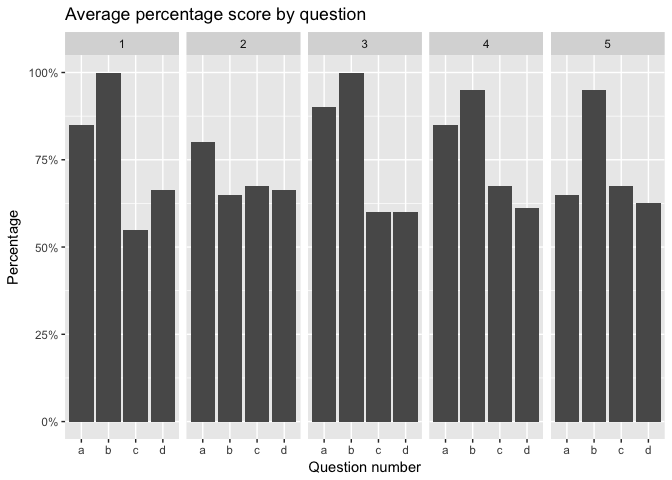
Performance for each question
Now let’s analyse which questions the students found easier and harder. This could be useful in order to direct future teaching.
We use the exam tibble again, this time grouping by sub-question instead of by pupil. Here’s a preview of the first few rows:
exam %>%
  group_by(Number, Part) %>%
  # calculate average percentage score for each sub-question
  summarise(Percentage = sum(Score) / sum(Possible)) %>%
  head() %>%
  kable(format='markdown')
| Number | Part | Percentage |
|---|---|---|
| 1 | a | 0.8500 |
| 1 | b | 1.0000 |
| 1 | c | 0.5500 |
| 1 | d | 0.6625 |
| 2 | a | 0.8000 |
| 2 | b | 0.6500 |
Adding on to the commands above, we’ll use ggplot to visualise the average percentage mark for each sub-question. This time we’ll use facet_grid to split the plot into sections, one per question number.
exam %>%
  group_by(Number, Part) %>%
  summarise(Percentage = sum(Score) / sum(Possible)) %>%
  ggplot(aes(Part, Percentage)) +
  geom_col() +
  scale_y_continuous(labels=percent_format()) +
  facet_grid(~ Number, scales='free', space='free') +
  labs(title='Average percentage score by question',
       x='Question number')
Detailed breakdown for each student
Above, we’ve created a summary for each student and each question. Now let’s create a graph for each student to help them understand their individual performance in each question.
In order to automate the process of creating a similar graph for each pupil, we pipe the list of pupil names from the markbook into the purrr package’s map function. The argument given to map is a function that we create which summarises the relevant student’s exam data and pipes it into ggplot.
markbook %>%
  pull(Name) %>%
  map(function(pupil) {
    exam %>%
      filter(Name == pupil) %>%
      group_by(Number) %>%
      summarise(Score = sum(Score),
                Possible = sum(Possible)) %>%
      # fct_rev to put lowest question number at top of y axis
      ggplot(aes(x=fct_rev(as.factor(Number)))) +
      geom_col(aes(y=Possible), data=questions, fill='red', alpha=0.3) +
      geom_col(aes(y=Score), fill='forestgreen') +
      labs(title=paste('Mark breakdown for', pupil),
           x='Question number', y='Marks') +
      coord_flip()
  })
One of the graphs created is shown below.
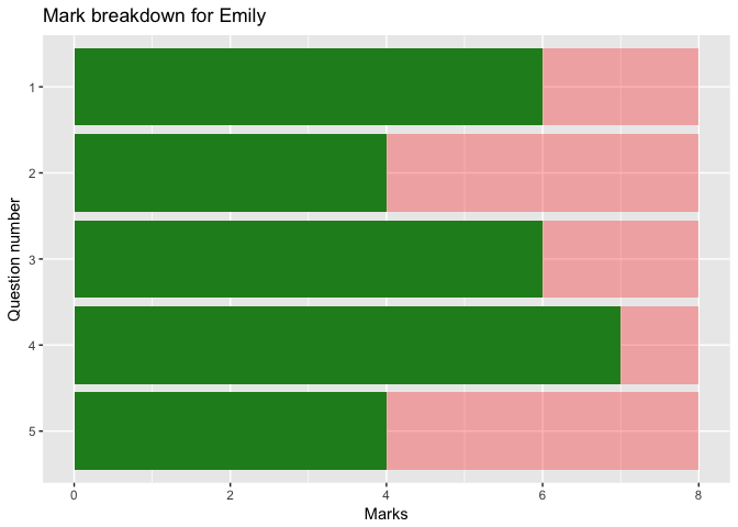
If each question included sub-questions covering different topics or using different techniques, we could’ve included a category for each sub-question in the questions.csv file and used this category on the y axis instead of the question number.
Learning to use R and the tidyverse
If you haven’t already, why not read my other post about analysing student data using R and the tidyverse? If you’d like to learn more about R and the tidyverse, Hadley Wickham and Garrett Grolemund’s book R for Data Science (available electronically for free) is a great place to start. If you have any questions about using R to analyse student data, why not get in touch with me on Twitter?